Styling Your BEE Email for Desktop vs Mobile
Life on the go

Though you may find yourself checking your email while sitting at your desk with your laptop or desktop computer, increasingly people are turning to their mobile device to keep up-to-date with their inbox.
The conscientious email designer will take into account the devices on which their emails will be seen to ensure that no matter the electronic medium, a professional, thoughtful, visually pleasing correspondence leaves a good impression with the recipient. This may require tweaking the email to display slightly differently on a desktop environment versus a mobile one.
Recently added into BEE is the hide on desktop feature to accompany the hide on mobile option that was already there.

How can I preview what my email will look like before sending?
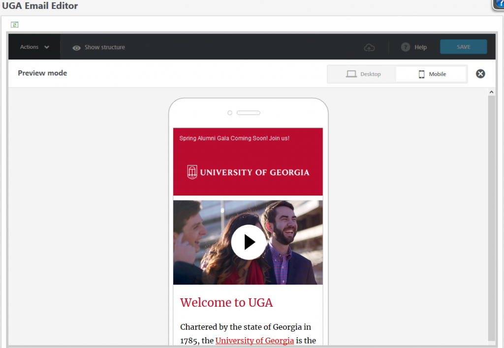
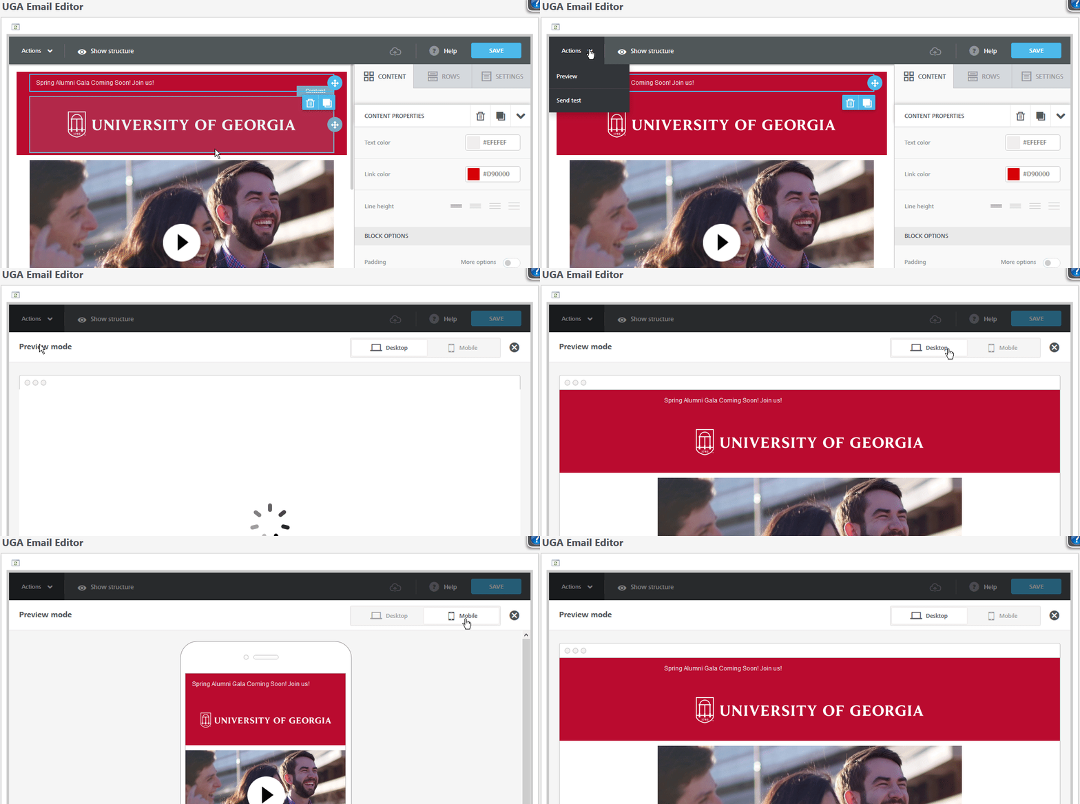
Whenever you get to the point where you’d like to see what your email is going to look like, there is a preview option built into BEE. Be sure to save your email first, the click the actions drop-down in the top left and select preview. In the preview pane that appears, you can select between desktop and mobile and scroll through each to see how your email will display on these two different screen types.
Changing how an element displays
When considering a more responsive email design, it’s important to know how to handle the mobile versus desktop versions of the email. Since the screens of cell phones and tablets are long and slender, BEE defaults to arranging any side-by-side content in your email into one column. Those two pictures you put next to each other in the editor will be stacked on top of one another when viewed on a cell phone. But, perhaps the “stacked” mobile version doesn’t look quite how you want it to. How can you differentiate the two? Before there was only the don’t stack on mobile toggle, but this didn’t always give you the right look on small screens. Now you have more flexibility with the new hide on desktop/mobile function!
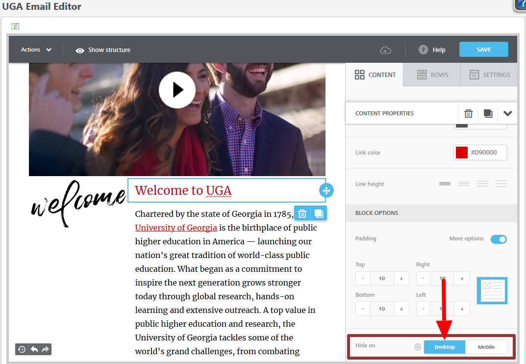
To find these options, click on the element you wish to hide and in the content properties side bar that appears (on the right) scroll all the way down to block options. Here there will be a hide on selector. You can choose either desktop or mobile and it will hide that particular element on the screen type selected. Check out the example below for when you might use this feature.
Hide on desktop
For the desktop version of my email, don’t want to display the red “Welcome to UGA” heading, so I’ll click on that text box and select hide on desktop in the content properties side bar on the right.

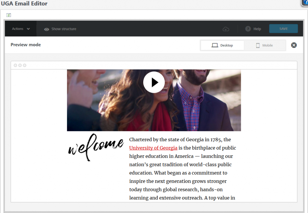
Hide on mobile
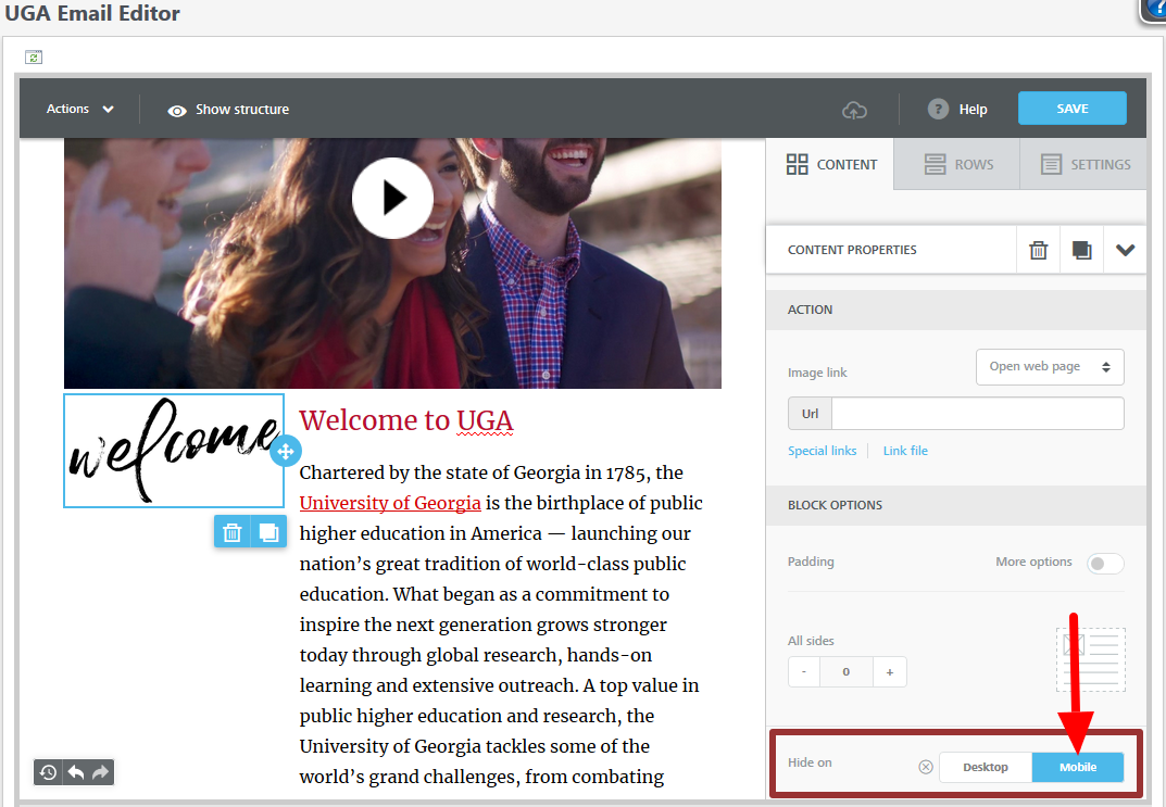
For the mobile version of my email, the “Welcome” scribble text looks out of place when BEE stacks it for mobile devices. So I’d like to hide it on mobile and just have my red “Welcome to UGA” header instead.
